Friday 17 December 2010

Final Advertisement...

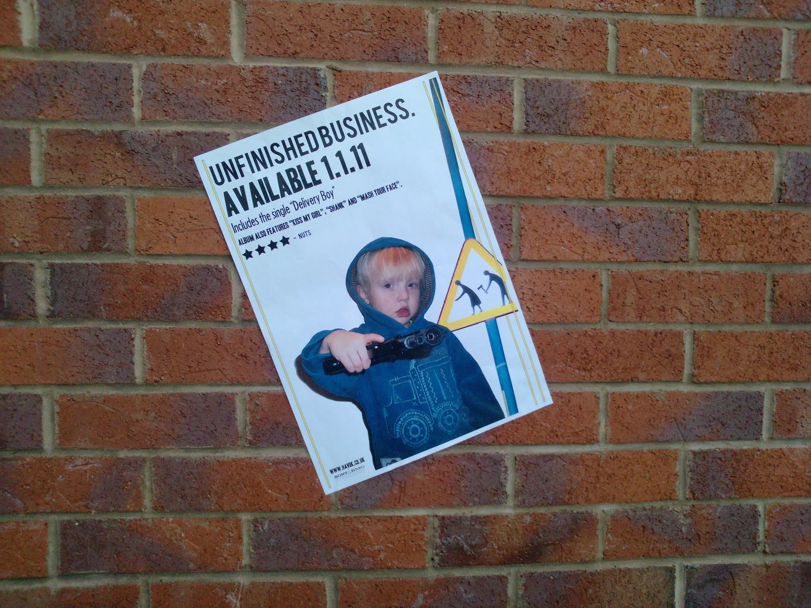
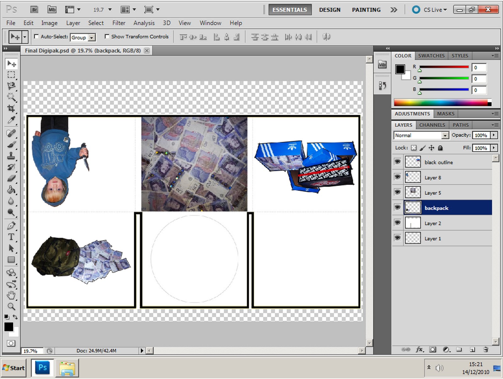
This is my finished advertisement, like the Digipak this had alot of developmental decisions put into it. I spent hours simply trying to decide whether to include a picture of the actual Digipak within the poster or not!
I spent alot of time referring to the Digipak and advertisement I studied earlier for Eminem's album - Recovery.
"Recovery" uses a running theme within both the Digipak and the advertisement, yet an image of the album is not actually incorporated into the advert.
My advert and Digipak use a running theme, such as the bold imagery and low opacity double yellow lines.
I was inspired by Eminem's album where the artist's name is not actually put onto the album or advert. So on my advert the only place the name is shown is on the website detail in the bottom corner; I think this connotes that "Havok" is of high status and doesn't need to be named.

I spent alot of time on the small details, so like my Digipak, every item on this page is measured up and perfectly placed, I used Photoshop to manipulate the signpost behind the model, as you can see the old man is trying to attack the old lady with an axe.
Maybe the old man had unfinished business.


Final Digipak...

This is my final Digipak.
I am very happy with the outcome, it took alot of experimenting and development to get it to the finished point.
I wanted to go for a modern, crisp, clean approach; I didn't want my Digipak to be swamped with busy pictures and over the top filters which in my opinion would look amateur and rushed.
I tried to go for a style that was bold and sharp, I wanted my Digipak to look precise and smart.

Everything on the Digipak is put in position carefully, the yellow trim is symmetrical on both sides, and I changed the opacity of it so it wouldn't draw the attention from the main images.

I arranged the layers in a way so that the yellow trim overlapped and under lapped certain parts of the Digipak, I also did this on the advertisement.
The reason for the yellow lines running across are not just to give it that little bit of extra detail and order, the lines are supposed to represent the double yellow lines on a road, fitting in with the urban theme of the song and music video.

Each picture has been carefully selected and edited, for example, both the image of the shoe boxes full of money and the backpack full of money took along time to get in the state I wanted. I had to cut them out from the background, I then used individual black lines to draw around the images making them bold & graphic.

I applied the filter "Dry Brush" to the pictures of the young boy, yet I had to adjust the settings so that the effect wasn't overpowering.

I stuck with the original fonts that I downloaded and I believe they worked well.
As you can see I used the close up of the pile of money for the back panel illustration, even this required editing, before I applied detail above it such as the barcode and website.

I was looking on the Internet at Digipaks and I felt the most successful ones were the ones that were bold and rememberable, I think the attention to detail within my digipak, aswell as the conscious decision to keep it tight and modern was the right thing to do as it fits in with the genre of my music.


Wednesday 15 December 2010

Digipak Advert Development...


Just like the screengrabs from when I was making my Digipak, I have done the same to show the development of my advertisment...


Digipak Development...


Using print screens, I can show you the development of my print work.
The various screen grabs show the alterations and development within the production of my work...


Animatic Storyboard...

Like I planned, me and my partner created an animated version of the storyboard I drew.

This animatic storyboard runs smoothly alongside our chosen song and gives a strong idea of our music video's script.
The storyboard only gives a rough idea of the music video's narrative.
There are some scenes/shots which have not been included into the storyboard which will be included in the actual video.
This storyboard is just to give a fairly detailed outline of our music video.

Storyboard...

I drew this storyboard, it shows a rough idea of what my music video's story is, aswell as an idea of the shots etc.
This storyboard shows 96 cuts, whereas our music video will probably have around 120.
This will work as a sort of script in the production of our music video, it will give a detailed idea of frames and timing and so on.
Overall I am proud of this storyboard, I think the large amount of frames gives a strong idea of what our music video is about.

I plan to take a photo of each individual frame, I will then turn this storyboard into an animatic storyboard using Adobe Premiere Pro.
The animatic storyboard will show very clearly how our actual music video is going to run.


Monday 13 December 2010

Downloaded Fonts...

I used the website "Dafont" so that I could download a few typefaces which I wanted to use within my print work.

I wanted fonts that were strong and solid yet also interesting and effective.

I chose three fonts... "28 Days Later" "Bebas" and "Headline".


Chosen Printwork Photography...

All my images narrowed down to the final cut....